Week 8

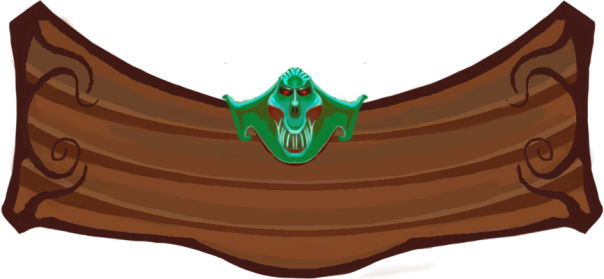
This week i have recolored and shaded various assets in the game, to make the game feel more consistent. This was before the makeover of captain Skip Legday:


swimming animation 3 - cutlass edtion

At this point we had no light, no shading and only local colors.

This is after the recoloring:


skip canon

skip death

skip swim

skip swimming with sword


The line art and animation was done by Kevin Alonso, but i took myself the freedom to remake the beard, making it look more affected by gravity.  I also discovered, as i was uploading these gifs, that there is quite a lot of disturbance in the background that needs to be cleaned up.

The trick i use when shading is using the secondary color for shading, and mixing in some of the lights secondary color as well. (The opposite color of the primary color you’re using, in the color wheel)

This gives a more realistic feel rather than for example using the same color as the skin but darker.

The leg that’s further away is a little bit darker than the one that’s closer to give a bit of depth.

The animation with colors and line art separated into different layers were obviously a lot easier to repaint. Maybe it goes without saying, but keep a copy with these separated just in case. Never know when you need them.

This is the animation of the blowfish:

Blowfishcolor-full-animation-2 blowfish-recolored


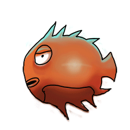
It was med by Oskar Kervefors. I recolored it from completely orange colored to some shading and a bright light reflection on the cheek. When attacking, it blows up to its full potential.  When it dies, it explodes. To color the exploding bits of the fish, i marked all the bits with the magic wand tool. Then i put the unexploded fish in a layer mask with the ”reveal all” setting above the exploded one. I marked the layer mask and used black color to reveal the fish by painting where i want the colors from the whole fish to be revealed in the exploding parts. And thanks to the marked area, the fishes color was only hit right where they needed. I have no idea if that made any sense at all, but it’s my best way to explain it.

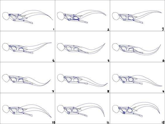
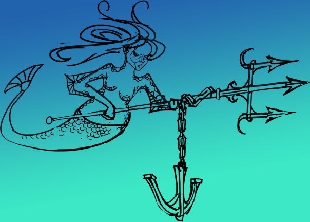
Next up i shall finish my mermaid animation, which still needs hair and a death animation. Then i will detail the parallax background, and recolor the randomly spawning level assets and recolor our exploding barrel and of course our swordfish animation.

See you next week.

Week 7

This week i have worked on the  animation of the mermaid enemy, but i have worked on the menu as well, and that is what i will be covering in this weeks blog. This was the result:

UImenu 2

Before i go into detail, here is a quick overview over my work and thoughts:

The background  is intentionally taken from the game to reveals what the game will be like. I made the menu out of wood, with planks that are closely associated to pirate ships. A metal skull of a mermaid in the middle as the final piece that really works as a symbol of what the game is about – killing mermaids.

The menu buttons are scrolls and my belief is that people will associate this to a treasure map, or or something else that might be lying around in a captains private quarters.

The chains also feel like something you might find on a ship. I got inspiration from the Warcraft 3 menu, and hopefully we will have time to animate the menu coming down from above linked to the chains.

Now, to the details:

chain

The chain is a tile that can be reused for other purposes. It was a challenge making it tile forever, but using the offset tool helped alot. I made sure to have the right colors, using the opposite color of green to make the shadows.I put the intense datk green color between the brown shadow and the green light, giving the chain a metallic feel. The trick to making a good chain, i discovered, was to make each link face the opposite direction to the previous. At first, the chain was blue, but i recolored it green to make it fit in with the rest of the picture.

title

This is the title window, where the logo will be attached.The skull was at first supposed to be the one of a mermaids, but in all hurry to get done, i feel like some other random fishmonster. It still felt relevant enough so i kept it, but if there is time i will revisit it

At first, the mermaid kind of got lost in the rest of the menu screen, so i made the colors really intense to make it pop out from the rest of the picture. It’s after all the crown jewel of the entire screen.


menu.png

This is the menu window. Just like the title window, it has some interesting patterns in each corner, something you often find in 1600 – 1700 art and architecture, ships are no exception. The key when making these patterns is to kind of make them point, towards the middle, since thats where the buttons and the focus should be. It can be harder than one would think.


scroll

This is button. I feel like itneeds some more details, like maybe a stick that the scrolls is wrapped around. The torn end needs a bit more work and polish. At first, i made it the paper lighter in the middle, where the texts supposed to be. However, it ended up looking to out of place so it took it away.

scroll marked

This is the scroll when marked, It becomes green and a slightly bigger when hovering over it, to add some fun feedback even in the menus. The green color matches is there to match the background and the mermaid skull on the title menu.


Week 5

This week we have focused on making tiles, reusable assets. We figured out that instead of making huge chunks of art, we could draw individual reusable objects. These ”tiles” feels a bit more static but gives us new advantages:

  • It’s easier to build smart level design when you don’t need to make an entirely new painting every time you come up with something. The level designers can put a level together like Legos.


  • You can put a lot more detail and precision to to these objects than you could otherwise. For example, instead of wasting time quickly producing 5 meters worth of sand, i could focus on a limited portion, and give it exceptional resolution, values, color and lighting. This was the result:


mermaid dunes


These sand dunes loops perfectly and can be put together to make an infinite map. Meanwhile, Kevin, another graphics artist in my group have been cutting out pieces of rocks, ship wreck parts and corals from previously made background art, cleaned them up and made them ready to be used as sprites. In conclusion, we have saved enormous amounts of time using tiles.

  • Tiles are also easy to recolor, for even more variety.

I have also begun animating the mermaid enemy. As i haven’t had the time to animate before in this course, i felt it was necessary to make some more research, so i watched YouTube videos about the twelve principles of animation:

This proved to be a good reminder from previous lessons. I also watched how other people had dealt with animating mermaids, for inspiration, as well as looking at this mermaid animation sheet for guidance:
mermaid animation sheet

Here is a first picture of how the animation. Hopefully i it will have a few more frames next week:

main mermaid animation 1

The challenge here is to make the snake like, rippling effect of the lower part of her body while utilizing the 12 principles of animation.

The mermaids look will be based on an early piece of concept artwork i made at the start of this project:

the mermaid

This what we ultimately want the mermaid animation to look like: dangerous, scary and strong. Dark eyes, scales around the edges of her skin, hair flowing dramatically in the water and a very threatening trident. The anchor might not make it, but maybe the chains.

I will have to learn animation quickly, there is a lot to do until next week when the beta needs to be finished.  We have to put quantity over quality at this stage as there will be more time for polish after the beta deadline.

Week 4


This week i have been working further on the background, which is now three times as long. I have also reworked the colors that felt a bit too ”dirty” and did not drive the focus towards the player avatar enough, which the new colors does a lot better. The new line art helps with that as well, i have med it much thinner since my previous blog post. I added a diffuse filter to the background in Photoshop in order to make it feel more like it’s underwater and added a gaussian blur filter to it as well to make the foreground pop out even more.

There is also some concern about the pirate skeleton in the background image.  I did not think too much about its size in relation to the player avatar. I thought it might look somewhat more impactful and symbolic being the oversized. After getting feedback from other students, it seems that it might bother people that it’s not in actual size. I’m going to have to make a decision with the team whether or not the pirate is worth revisiting.

Image and video hosting by TinyPic

ipated. Much of these final effects have been premature as the there is some more clean-up to be done to the picture, but in order to get the background decent for the alpha, i quickly finished up this temporary version of the background. The line art still needs to be cleaned up and the background layer of the picture needs some more work in terms of colors.

I have also made the coin collectible that had to be in place for the alpha test. It had to be done quickly so that the programmers could implement it in the game, so i went straight to work without much reference research. For a golden coin with a skull on it to give it pirates touch. I put the coin on the background to make sure it looked nice, shiny and appealing in contrast to the rest of the map and the result was better than i had expected. It was supposed to be a place-holder coin, but it turned out to be popular in the group so we might actually keep it, though it might get revisited for better colors and if there’s time, an animation of it spinning

To be a bit self-critical, we, and me especially, need to be even better at distributing time and get things done on deadline. Looking forward, I will finish up the background and, make sure that a long needed style guide is in place.


mermaid coin.


Week 3


This week i have worked on the background of group 19s assigned game ”Mermaid River”.
One thing i kept in mind from the very start was to make sure the colors didn’t take up too much attention and that the line art wasn’t too sharp since i want the focus to be aimed at the character, the enemies and other things related to the actual gameplay.  I really had to be careful with that particular part because it’s not always easy to restrain yourself as an artist and actually keep away from the ”fun stuff”.

When choosing colors i began by gathering reference material. The game is set underwater in an exotic location so i goggled coral reefs and started sampling colors from there and turned those into a color palette. I then drew the lineart and filled it with things i would expect to find diving in Caribbean water, taking lots of inspiration from my gathered reference material. Coral reefs, sunken ships, sea weed etc. I made sure the line art was thick at the foreground, thinner further away. I made sure that the foreground of sand stood out from the rest of the picture, as that is the layer where the game itself is taking place.

I then colored the picture, carefully choosing nuances that would separate the foreground, middle ground and background. I Made sure to make the light come from above since we’re underwater. Certain details like the coral reefs got some extra saturation too express the colorful nature of them. I also colored the line art, to make it feel more as a part of the whole. It made the whole picture more harmonious for the eye to look at.

I still had some concern that the background would take up too much attention, so i added a gradient of blue over the whole picture, except the foreground where the game is taking place. I also used the blur tool in Photoshop to blur out the sharp line art to make sure that the eye will be directed at what’s actually important.

This was the end result of the week:

bakgrund mermaid 2

The picture still has to be cleaned up and I’m not entirely sure if the gradient overlay makes the picture a bit lifeless. I might also make the line art even thinner in order redirect the focus to what’s important. All that aside, the real challenge going forward will be making this background three times as big while keeping up with the schedule.