Månadsarkiv: mars 2016

Week 8

This week i have recolored and shaded various assets in the game, to make the game feel more consistent. This was before the makeover of captain Skip Legday:


swimming animation 3 - cutlass edtion

At this point we had no light, no shading and only local colors.

This is after the recoloring:


skip canon

skip death

skip swim

skip swimming with sword


The line art and animation was done by Kevin Alonso, but i took myself the freedom to remake the beard, making it look more affected by gravity.  I also discovered, as i was uploading these gifs, that there is quite a lot of disturbance in the background that needs to be cleaned up.

The trick i use when shading is using the secondary color for shading, and mixing in some of the lights secondary color as well. (The opposite color of the primary color you’re using, in the color wheel)

This gives a more realistic feel rather than for example using the same color as the skin but darker.

The leg that’s further away is a little bit darker than the one that’s closer to give a bit of depth.

The animation with colors and line art separated into different layers were obviously a lot easier to repaint. Maybe it goes without saying, but keep a copy with these separated just in case. Never know when you need them.

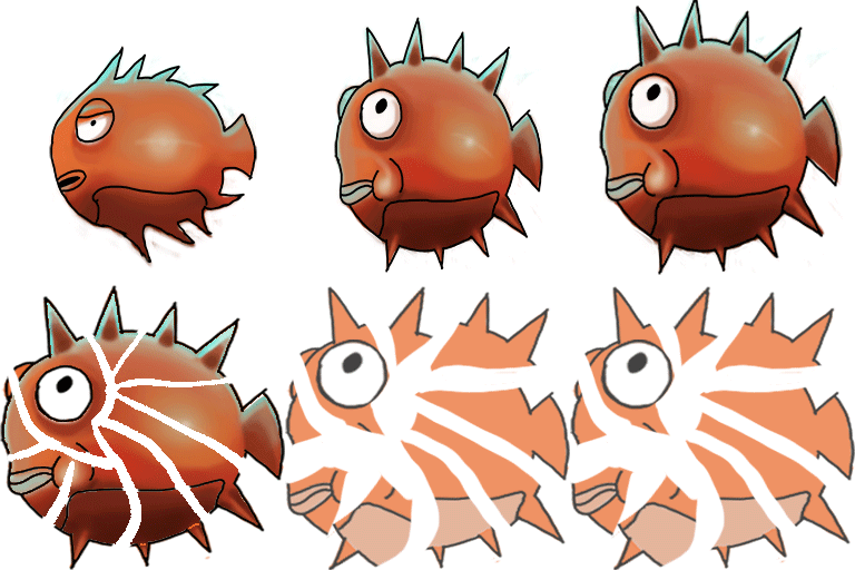
This is the animation of the blowfish:
Blowfishcolor-full-animation-2 blowfish-recolored


It was med by Oskar Kervefors. I recolored it from completely orange colored to some shading and a bright light reflection on the cheek. When attacking, it blows up to its full potential.  When it dies, it explodes. To color the exploding bits of the fish, i marked all the bits with the magic wand tool. Then i put the unexploded fish in a layer mask with the ”reveal all” setting above the exploded one. I marked the layer mask and used black color to reveal the fish by painting where i want the colors from the whole fish to be revealed in the exploding parts. And thanks to the marked area, the fishes color was only hit right where they needed. I have no idea if that made any sense at all, but it’s my best way to explain it.

Next up i shall finish my mermaid animation, which still needs hair and a death animation. Then i will detail the parallax background, and recolor the randomly spawning level assets and recolor our exploding barrel and of course our swordfish animation.

See you next week.
Week 7

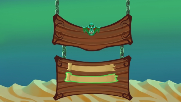
This week i have worked on the  animation of the mermaid enemy, but i have worked on the menu as well, and that is what i will be covering in this weeks blog. This was the result:

UImenu 2

Before i go into detail, here is a quick overview over my work and thoughts:

The background  is intentionally taken from the game to reveals what the game will be like. I made the menu out of wood, with planks that are closely associated to pirate ships. A metal skull of a mermaid in the middle as the final piece that really works as a symbol of what the game is about – killing mermaids.

The menu buttons are scrolls and my belief is that people will associate this to a treasure map, or or something else that might be lying around in a captains private quarters.

The chains also feel like something you might find on a ship. I got inspiration from the Warcraft 3 menu, and hopefully we will have time to animate the menu coming down from above linked to the chains.

Now, to the details:

chain

The chain is a tile that can be reused for other purposes. It was a challenge making it tile forever, but using the offset tool helped alot. I made sure to have the right colors, using the opposite color of green to make the shadows.I put the intense datk green color between the brown shadow and the green light, giving the chain a metallic feel. The trick to making a good chain, i discovered, was to make each link face the opposite direction to the previous. At first, the chain was blue, but i recolored it green to make it fit in with the rest of the picture.

title

This is the title window, where the logo will be attached.The skull was at first supposed to be the one of a mermaids, but in all hurry to get done, i feel like some other random fishmonster. It still felt relevant enough so i kept it, but if there is time i will revisit it

At first, the mermaid kind of got lost in the rest of the menu screen, so i made the colors really intense to make it pop out from the rest of the picture. It’s after all the crown jewel of the entire screen.


menu.png

This is the menu window. Just like the title window, it has some interesting patterns in each corner, something you often find in 1600 – 1700 art and architecture, ships are no exception. The key when making these patterns is to kind of make them point, towards the middle, since thats where the buttons and the focus should be. It can be harder than one would think.


scroll

This is button. I feel like itneeds some more details, like maybe a stick that the scrolls is wrapped around. The torn end needs a bit more work and polish. At first, i made it the paper lighter in the middle, where the texts supposed to be. However, it ended up looking to out of place so it took it away.

scroll marked

This is the scroll when marked, It becomes green and a slightly bigger when hovering over it, to add some fun feedback even in the menus. The green color matches is there to match the background and the mermaid skull on the title menu.